a selection of my work
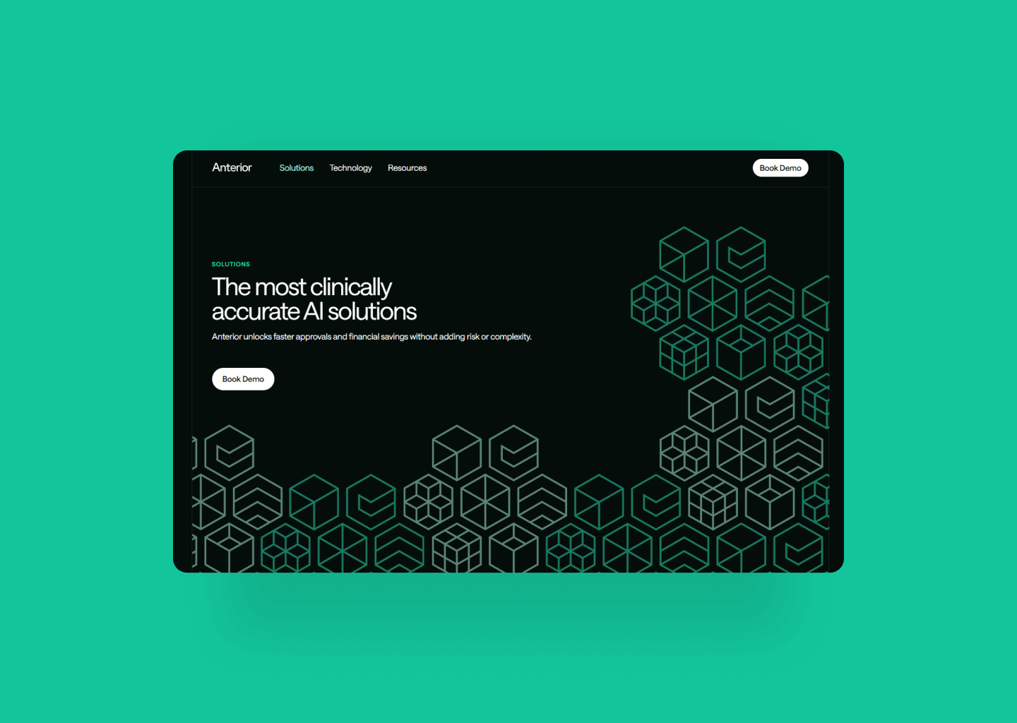
Brim Analytics
Branding by Spencer Peppiatt.
EmailBoutique
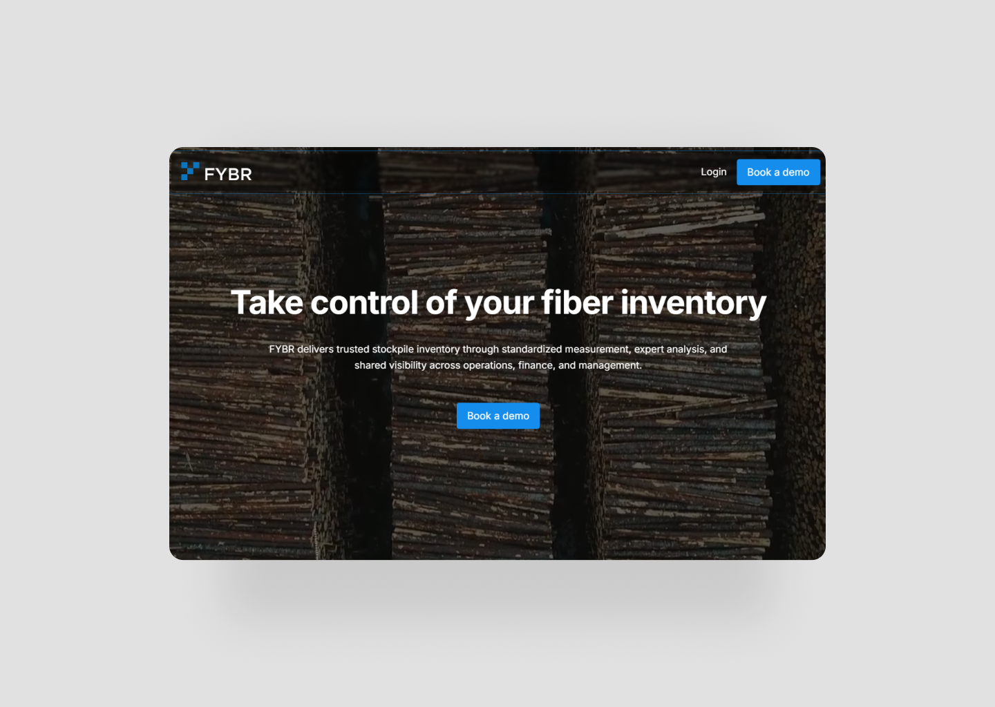
Project completed while at Slam Media Lab.
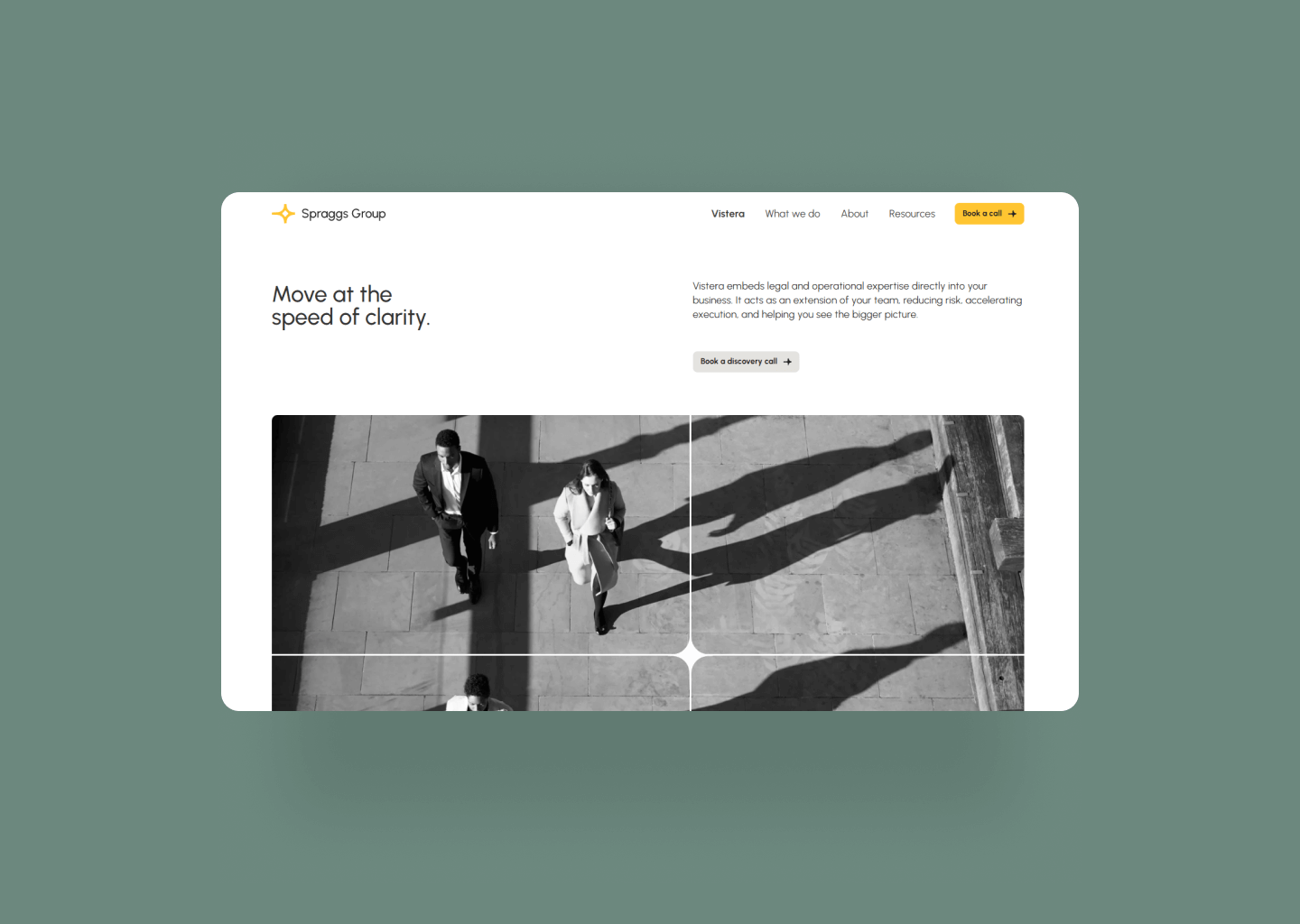
Sprig & Sprout
Enigma
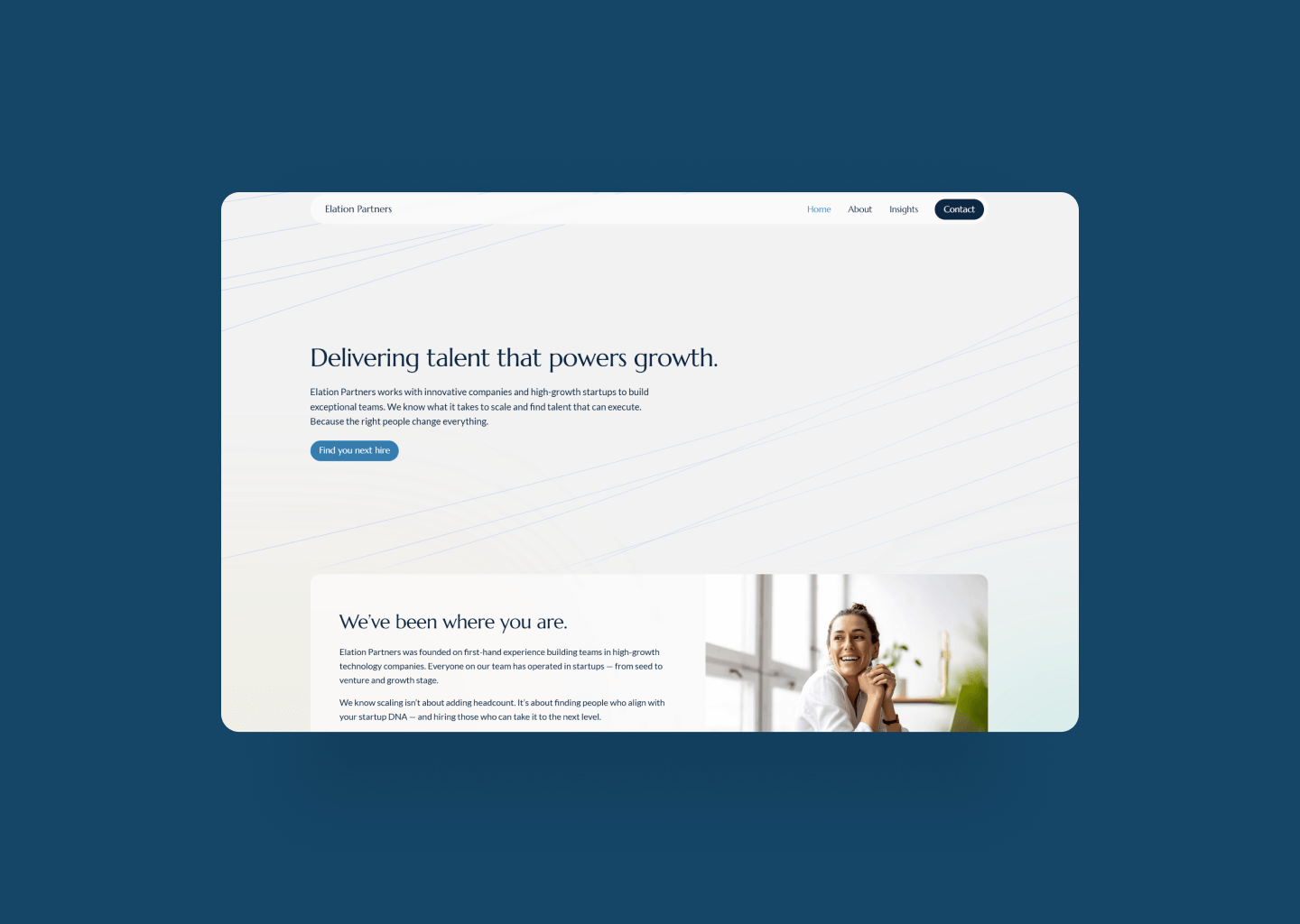
8 West Clinic
Twigs Paper
Twigs Paper is an eco-friendly paper products e-commerce store. They have a beautifully curated website with products that are equally as beautiful. This Webflow development is done as practice to create responsive sites and as my take on Flux Academy's Design Challenge for June 2021.
Development Criteria
The challenge highlights the following as elements for evaluation:
- How visually similar the development is to the original
- Class usage efficiency
- Load speed
- CMS simplicity (if applicable)
- Responsiveness
- Animations
- Layout efficiency
- Element usage efficiency (ex. no extra divs)
The Process
Replicating or recreating the general look of a website is pretty straightforward, but nailing small details can be challenging. In the case of Twigs Paper's homepage, every section had slightly different layout and different animation. As much as I want to say it was easy recreating Twigs Paper's homepage, it was not all straightforward.
I used a combination of the CSS Peeper extension and Chrome DevTools to inspect the make of each web element. This process was lengthy but I gathered a lot of information on class, div, and animation specifics. Specifically how they all responded to different screen sizes.
Aside from native customization-abilities in Webflow, some elements and interaction required custom code. Below are a few of the custom elements.
Custom Fonts
Twigs Paper's site uses custom fonts purchased from Klim Type Foundry, specifically they use Tiempos and Calibre. I was able to download test fonts to use for free. Custom fonts can easily be implemented on Webflow.
CSS Customization
CSS code was added to customize scroll bar colors, select hover interactions, and text selection color.
Custom Slider Using Slick
The slider in "Our Best Seller" section uses slick slider by Ken Wheeler. Slide styling and customization was done through HTML.
The Result
The overall development was a lot of fun and I think it turned out really well! Check out the live site to see all the custom interactions - I must say The Papestielliz did a killer job on the design. If you're interested in seeing my development up close, you can clone the site on Webflow.
After a lot of waiting, the challenge results were finally announced in November: I WON the challenge! 🎉
Check out the challenge review below and see all the other top entries!
Design by The Papestielliz.
Twigs Paper
Verdi
La Chaine Vancouver
Fluence Tech
Media Profile
Project completed while at Slam Media Lab.
Community Skills Initiative
Gallant Investment Partner
International Aviation Marketing
Popcorn Digital
UNDR Staking Pool
This redesign is completed for Flux Academy's Design Challenge for PoolUnder (UNDR), a staking pool on the Cardano blockchain network.
The Goal
Pál, the operator of PoolUnder, wanted to further refine his landing page. He had already paid for a few re-designs but is not 100% happy with them. His ideal landing page would target broad spectrum of users that are interested in earning through cryptocurrency holdings. He wanted the page to be simple, informative, and serve three main objectives:
- Provide content so users learn about staking on the Cardano network
- Feature a tool, staking reward calculator, for users to see how much they can earn
- Showcase staking expertise and pool's performance, so users are happy to delegate their shares to the pool
Design Audit
After looking through the existing re-design, I thought the page already looked pretty good - it had good visual graphics, color pairing, decent copy, and design hierarchy. I was unsure if I could make small changes to the existing design to improve it. So, I decided to completely revamp the design from scratch.
With reference to design inspirations provided by Pál, and his focus on user journey with the use of Visual Attention Software, I summarized key features to include in my redesign:
- Use of vibrant or variety of colors
- Use of slider feature to display content
- Strong design hierarchy and contrast to guide user's attention
- Use of easy-to-understand language throughout page copy
My Redesign
My redesign is based on the above identified key features.
Color
Because all of Pál's design inspiration (Stripe, Syslog-ng, Pure Storage) had colorful features - I wanted to incorporate as many colors as I can without over-doing it and turning the page into a visual mess. To achieve this, I selected three main colors and used gradients of these colors as much as I can throughout the site. I found gradients help with the overall visual appeal and it also bring attention to areas where there is the most contrast.
Slider feature
Pál expressed that he needed a slider to display content. Because of this, I incorporated the use of tabs in the "how does it work" section. The use of tabs helped breakdown the text-heavy section into digestible chunks so users are less likely to be overwhelmed.
Strong design hierarchy
The redesign features clear distinction between headings and paragraphs. On top of that, I was able to use background gradients to guide user's visual attention to important sections like the CTA button in the hero section, the potential earning numbers in the rewards calculator section, and the pool's KPI in the performance metrics section. The design hierarchy is validated using 3M's VAS.
Easy-to-understand language
To achieve Pál's goal of providing educational content for users to learn about staking, I edited the page copy to be reader friendly for users with little crypto-knowledge.
UNDR Staking Pool
Lost Wandering
Lost Wandering is an adventure blog that provides information on hiking trails and travel destinations. It is an ongoing personal project to document my travels, feature my photography, and inspire others to get outdoors.
The goal
Design and develop a responsive blog that is SEO-optimized and celebrates landscape imagery.
WordPress to Webflow
This blog was started in 2019 on WordPress, and was transferred to Webflow in April of 2021.
Lost Wandering
Viva Cafe
The Project
Redesign and develop a simple and approachable web presence for Viva Cafe.
Viva Cafe
A&D Engineering
The Project
Redesign and develop a modern website for a software sales representative in Asia.